An organization that had already made a mark for itself in the region, Compassdoon required a strong digital presence to let students from all states recognize the opportunity and come and get trained under expert educators.

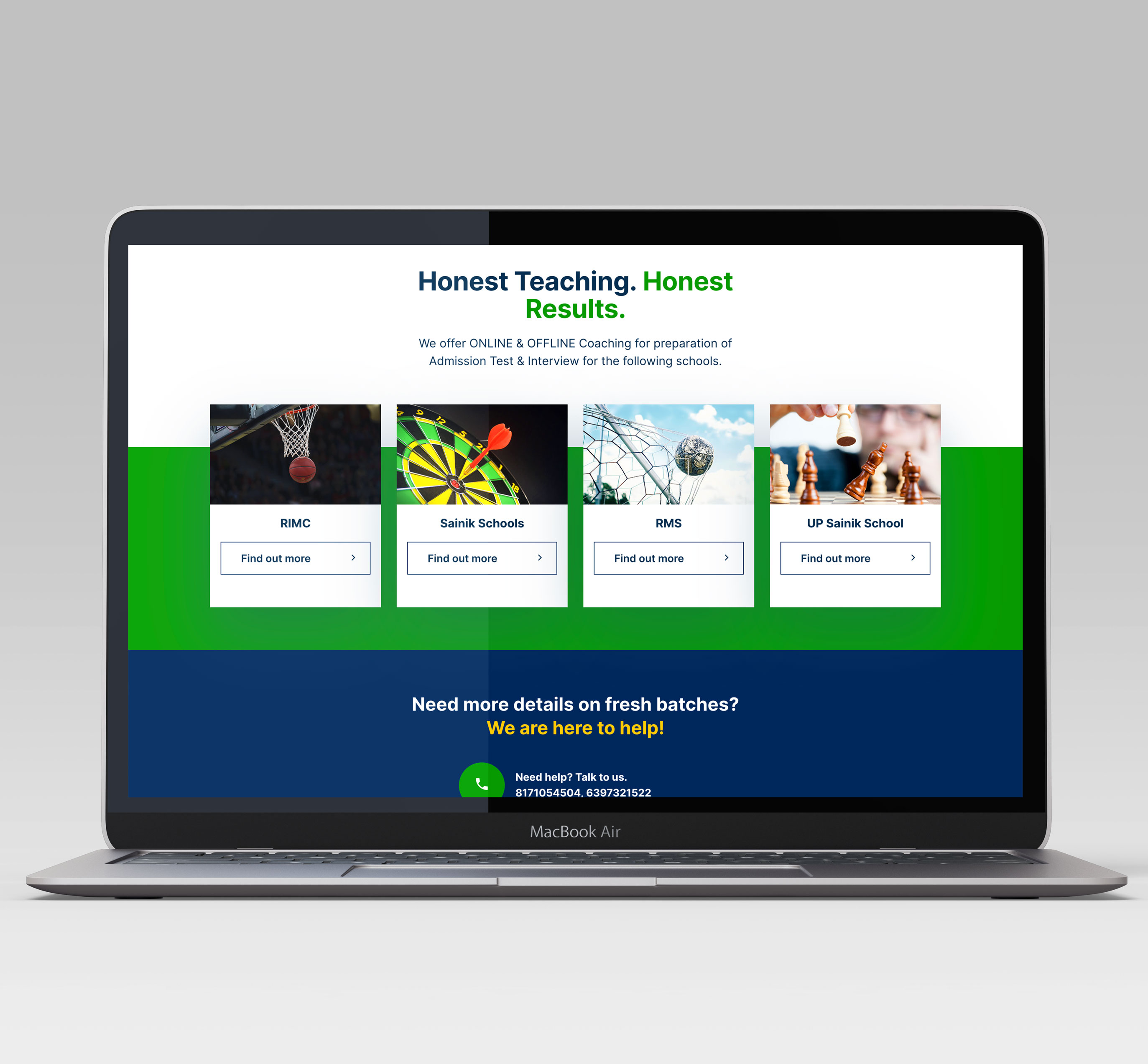
Compassdoon is a trusted name in Dehradun's education circuit, providing extensive coaching to young students for clearing the exams of prestigious schools like RIMC, Sainik Schools, RMS, and UP Sainik School.
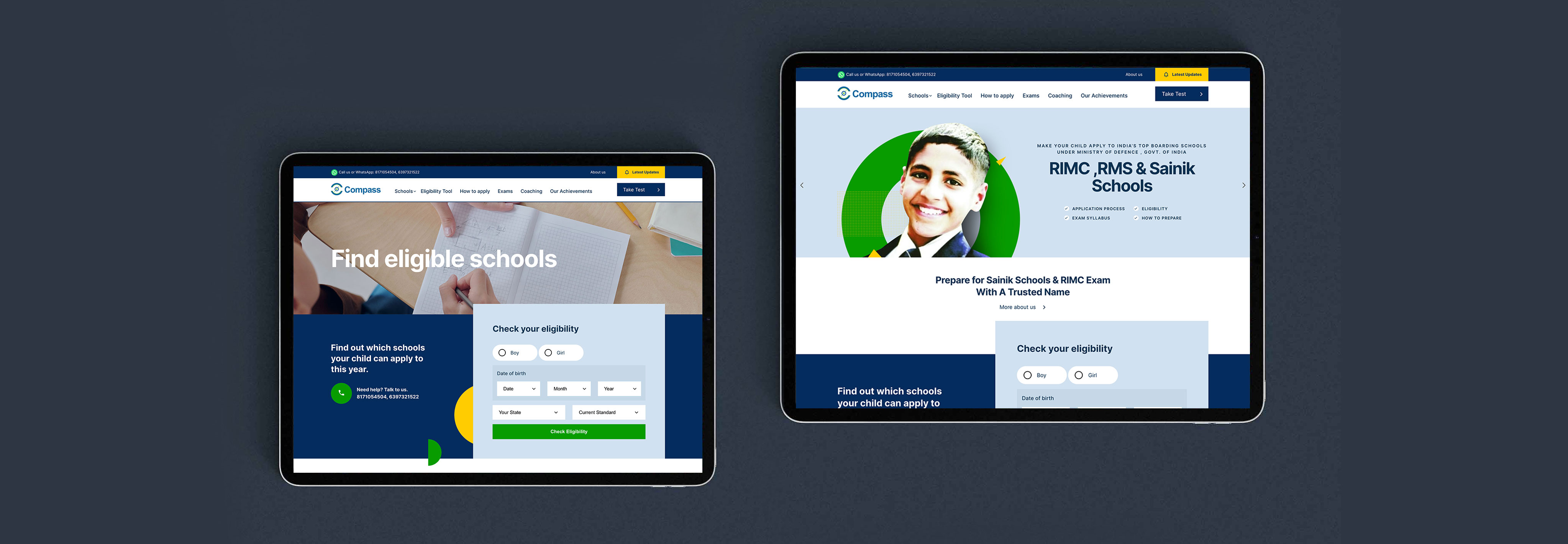
Compassdoon sensed a need for a functional website that was flexible, could be customized to add important elements and was not constrained by templates and formats. After gaining insights over the methodologies used by them to guide students, a CMS website was created to match all their requirements and incorporate all their offerings in a way that was apt to target students and parents effectively.


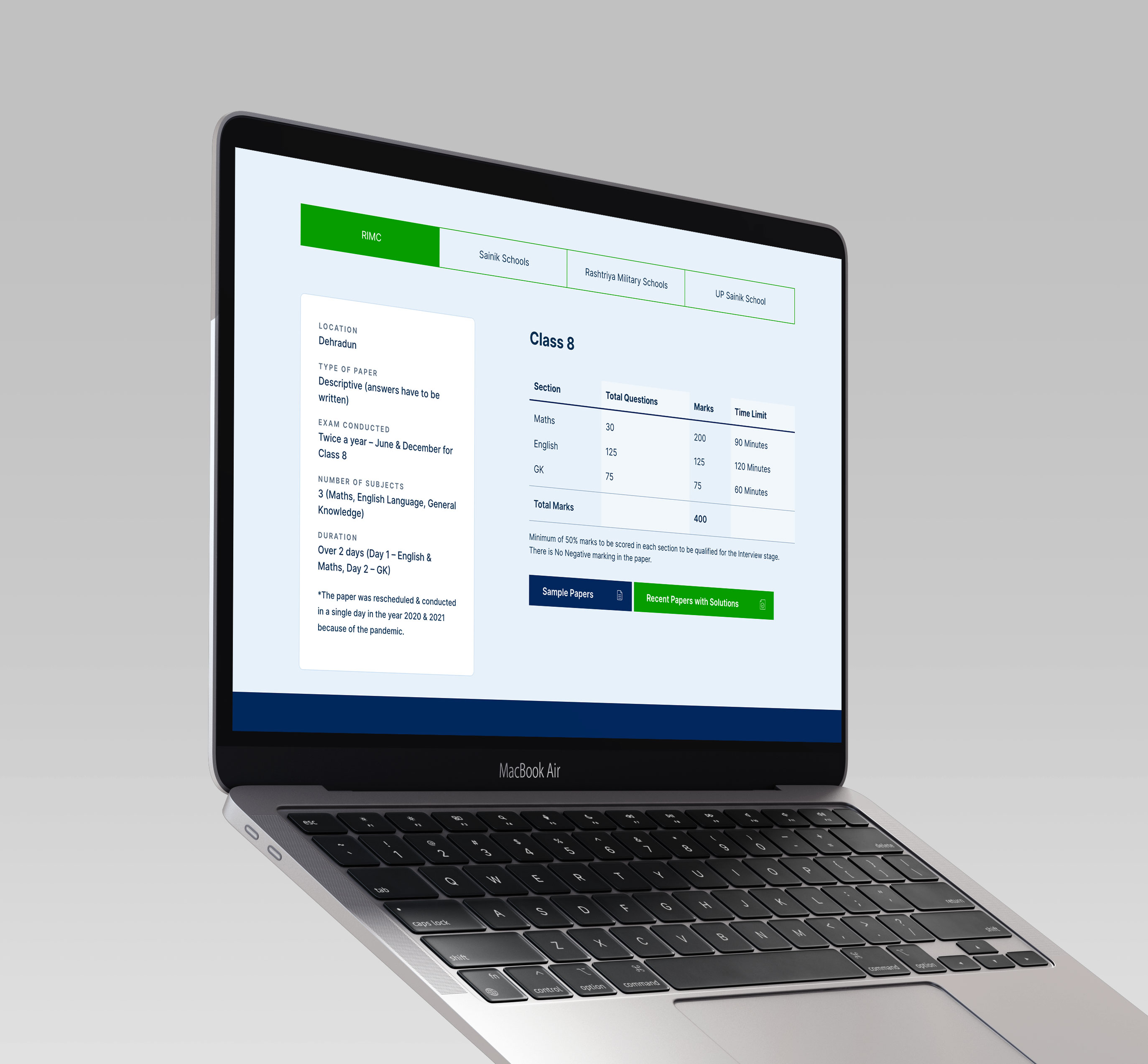
Since it is a field that requires trust-building before a parent sends his child for coaching, an intuitive interface that projects data in a clear, concise, and responsive manner was important. Developing a simplified sitemap and organizing content under menus was necessary for Compassdoon's website because it allowed the website to be structured just how parents and students wanted it to. Facts about an impeccable past record, the experienced faculty, and the exams that the coaching institute covers were presented before visitors in a consistent, attractive, and efficient manner, making it easier for them to arrive at a decision quickly.
The competition for Compassdoon, although, was quite stiff. To make students know more about their coaching center, the website needed to rank higher on search engines. For this, an SEO strategy was put in place, and all website content was created on the same lines to improve the visibility of the website across various platforms. A smooth-running and swift website was an added benefit that indirectly influenced the time spent by visitors on the site.
Since mobile surfing is ten times more common than regular desktop searching, it was crucial to make the website compatible with mobile phones too. Thus, the same interface, UX design, and content were made available on the mobile version without any compromise on quality or structure.

To make the choice simpler for students, a unique Eligibility Tool was added to the website that could tell the students about the exams for which they were eligible, based on their current academic details. Subsequently, by showcasing the great track record of the center in helping students like them get through the same exams, the chances of conversion were improved.